
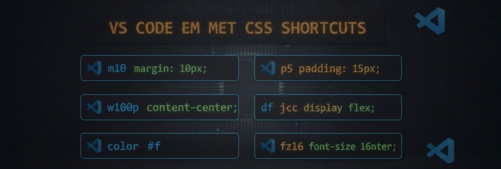
How Emmet Works in CSS
Emmet for CSS is a shorthand syntax feature in VS Code that expands abbreviations into complete CSS properties, allowing developers to write styles faster and more efficiently.
- Margin & Padding
|
Shortcut |
Output |
Tip |
|---|---|---|
|
m10 |
margin: 10px; |
Use m10-20 → 10px 20px |
|
mt10 |
margin-top: 10px; |
Also mb, ml, mr |
|
mx10 |
margin-left: 10px; margin-right: 10px; |
Horizontal spacing |
|
my20 |
margin-top: 20px; margin-bottom: 20px; |
Vertical spacing |
|
p10 |
padding: 10px; |
Same logic as margin |
|
pt5 |
padding-top: 5px; |
Also pb, pl, pr |
|
px20 |
padding-left: 20px; padding-right: 20px; |
Horizontal padding |
|
py15 |
padding-top: 15px; padding-bottom: 15px; |
Vertical padding |
- Width & Height
|
Shortcut |
Output |
Tip |
|---|---|---|
|
w100 |
width: 100px; |
Use w100p for 100% |
|
h50 |
height: 50px; |
Use h100vh for full screen |
|
mw300 |
max-width: 300px; |
Responsive layouts |
|
mh200 |
max-height: 200px; |
Control overflow |
|
minw200 |
min-width: 200px; |
Prevent shrinking |
|
minh100 |
min-height: 100px; |
Layout stability |
- Color & Background
|
Shortcut |
Output |
Tip |
|---|---|---|
|
c#000 |
color: #000; |
Any hex works |
|
c:red |
color: red; |
Named colors |
|
bgc#fff |
background-color: #fff; |
Common usage |
|
bg:img.jpg |
background: url(img.jpg); |
Image background |
|
bgr:nr |
background-repeat: no-repeat; |
Prevent repeat |
|
bgp:c |
background-position: center; |
Center image |
|
bgs:c |
background-size: cover; |
Full cover |
- Typography
|
Shortcut |
Output |
Tip |
|---|---|---|
|
fz16 |
font-size: 16px; |
Use fz1.5r for rem |
|
fw700 |
font-weight: 700; |
Bold text |
|
ff:a |
font-family: Arial; |
Quick font |
|
lh1.5 |
line-height: 1.5; |
Better readability |
|
ls1 |
letter-spacing: 1px; |
Headings |
|
ta:c |
text-align: center; |
Also l, r, j |
|
td:n |
text-decoration: none; |
Remove underline |
|
tt:u |
text-transform: uppercase; |
Text styles |
- Display & Position
|
Shortcut |
Output |
Tip |
|---|---|---|
|
d:b |
display: block; |
Default |
|
d:i |
display: inline; |
Inline elements |
|
d:ib |
display: inline-block; |
Hybrid |
|
d:f |
display: flex; |
Flexbox |
|
d:g |
display: grid; |
Grid layouts |
|
pos:r |
position: relative; |
Parent |
|
pos:a |
position: absolute; |
Child |
|
pos:f |
position: fixed; |
Sticky UI |
|
pos:s |
position: sticky; |
Scroll-based |
- Flexbox
|
Shortcut |
Output |
Tip |
|---|---|---|
|
fxd:r |
flex-direction: row; |
Default |
|
fxd:c |
flex-direction: column; |
Vertical |
|
jc:c |
justify-content: center; |
Horizontal align |
|
jc:sb |
justify-content: space-between; |
Spacing |
|
ai:c |
align-items: center; |
Vertical align |
|
fw:w |
flex-wrap: wrap; |
Responsive |
|
gap20 |
gap: 20px; |
Space between items |
- Grid
|
Shortcut |
Output |
Tip |
|---|---|---|
|
gtc:1fr |
grid-template-columns: 1fr; |
Single column |
|
gtc:1fr 1fr |
grid-template-columns: 1fr 1fr; |
Two columns |
|
gtr:auto |
grid-template-rows: auto; |
Auto rows |
|
gc:1/3 |
grid-column: 1 / 3; |
Column span |
|
gr:1/2 |
grid-row: 1 / 2; |
Row span |
- Border & Box
|
Shortcut |
Output |
Tip |
|---|---|---|
|
bd1#000 |
border: 1px solid #000; |
Quick border |
|
bdr10 |
border-radius: 10px; |
Rounded corners |
|
bxsh |
box-shadow: 0 0 10px #000; |
Shadow |
|
bsz:bb |
box-sizing: border-box; |
Layout fix |
- Effects & Animation
|
Shortcut |
Output |
Tip |
|---|---|---|
|
op.5 |
opacity: 0.5; |
Transparency |
|
trs |
transition: all .3s ease; |
Smooth hover |
|
trs.5s |
transition: all .5s ease; |
Slower |
|
tf:sc(1.1) |
transform: scale(1.1); |
Zoom |
|
cur:p |
cursor: pointer; |
Clickable |


“ Sir’s explanation of CSS, HTML, and Emmet codes in VS Code is truly amazing. Many of us did not even know about these Emmet codes before, but the way sir explains them from the basics makes everything very easy to understand. Learning these Emmet shortcuts has greatly increased our productivity and saved a lot of time while coding. These blogs don’t just teach syntax, they build confidence and motivate students to learn more. Sir’s dedication and hard work are clearly reflected in every post. ” Being a young learner of class 8, I really appreciate the way website is helpful to new beginners of coding.