
- What is CSS Units?
CSS Units are measurements used in CSS to define the size, length, spacing, and dimensions of elements on a webpage. They help control properties such as width, height, font size, margin, padding, and positioning. CSS units can be absolute (fixed values like px) or relative (flexible values like %, em, or rem), allowing developers to create both precise layouts and responsive designs that adapt to different screen sizes.
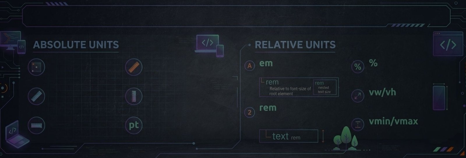
- Absolute CSS Units
Absolute CSS units define sizes that are fixed and do not depend on other elements or screen size. They represent real-world measurements or fixed pixel values, making them consistent across layouts but less flexible for responsive design. Common absolute units include px, cm, mm, in, pt, and pc, and they are typically used when precise control over element size is required.
|
Unit Type |
Unit |
Description |
Example |
|---|---|---|---|
|
Absolute |
px |
Pixels (fixed size) |
font-size: 16px; |
|
Absolute |
cm |
Centimeters |
width: 5cm; |
|
Absolute |
mm |
Millimeters |
width: 20mm; |
|
Absolute |
in |
Inches |
width: 2in; |
|
Absolute |
pt |
Points (1/72 inch) |
font-size: 12pt; |
|
Absolute |
pc |
Picas (1pc = 12pt) |
font-size: 1pc; |
Example:
<!DOCTYPE html>
<html lang="en">
<head>
<meta charset="UTF-8">
<title>CSS Absolute Units Example</title>

<style>
/* Pixels */
.px-example {
  font-size: 16px;
  color: blue;
}

/* Centimeters */
.cm-example {
  width: 5cm;
  background-color: lightgray;
  padding: 5px;
}

/* Millimeters */
.mm-example {
  width: 20mm;
  background-color: lightyellow;
  padding: 5px;
}

/* Inches */
.in-example {
  width: 2in;
  background-color: lightgreen;
  padding: 5px;
}

/* Points */
.pt-example {
  font-size: 12pt;
  color: red;
}

/* Picas */
.pc-example {
  font-size: 1pc;
  color: purple;
}
</style>

</head>
<body>

<h2>CSS Absolute Units Example</h2>

<p class="px-example">This text uses 16px font size.</p>

<div class="cm-example">Width set using 5cm.</div>
<br>

<div class="mm-example">Width set using 20mm.</div>
<br>

<div class="in-example">Width set using 2 inches.</div>

<p class="pt-example">This text uses 12pt font size.</p>

<p class="pc-example">This text uses 1pc font size.</p>

</body>
</html>- Relative CSS Units
Relative CSS units are based on another value, such as the parent element’s font size or the root font size. These units help create flexible and responsive layouts that adjust automatically depending on context. Common relative units include %, em, rem, ex, and ch, which allow elements to scale proportionally across different screen sizes and devices.
|
Unit Type |
Unit |
Description |
Example |
|---|---|---|---|
|
Relative |
% |
Percentage relative to parent |
width: 50%; |
|
Relative |
em |
Relative to parent font size |
font-size: 2em; |
|
Relative |
rem |
Relative to root font size |
font-size: 1.5rem; |
|
Relative |
ex |
Relative to x-height of font |
font-size: 2ex; |
|
Relative |
ch |
Width of the "0" character |
width: 20ch; |
Example:
<!DOCTYPE html>
<html lang="en">
<head>
<meta charset="UTF-8">
<title>CSS Relative Units Example</title>

<style>

/* Parent container */
.container{
  width: 400px;
  border: 2px solid black;
  padding: 10px;
  font-size: 16px;
}

/* Percentage example */
.percent-box{
  width: 50%;
  background-color: lightblue;
  padding: 5px;
}

/* em example */
.em-text{
  font-size: 2em;
  color: blue;
}

/* rem example */
.rem-text{
  font-size: 1.5rem;
  color: green;
}

/* ex example */
.ex-text{
  font-size: 2ex;
  color: red;
}

/* ch example */
.ch-box{
  width: 20ch;
  background-color: lightgray;
  padding: 5px;
}

</style>
</head>

<body>

<h2>CSS Relative Units Example</h2>

<div class="container">

  <div class="percent-box">
    Width using 50%
  </div>

  <p class="em-text">
    Font size using 2em (relative to parent font size)
  </p>

  <p class="rem-text">
    Font size using 1.5rem (relative to root font size)
  </p>

  <p class="ex-text">
    Font size using 2ex (relative to x-height of font)
  </p>

  <div class="ch-box">
    Width using 20ch
  </div>

</div>

</body>
</html>- Viewport Units
Viewport units are relative to the browser window (viewport) size. They help create layouts that adapt dynamically to the screen dimensions. Units like vw (viewport width), vh (viewport height), vmin, and vmax are commonly used to build responsive designs where elements scale according to the visible screen area.
|
Unit |
Description |
Example |
|---|---|---|
|
vw |
1% of viewport width |
width: 50vw; |
|
vh |
1% of viewport height |
height: 100vh; |
|
vmin |
1% of smaller viewport dimension |
width: 50vmin; |
|
vmax |
1% of larger viewport dimension |
width: 50vmax; |
Example:
<!DOCTYPE html>
<html lang="en">
<head>
<meta charset="UTF-8">
<title>CSS Viewport Units Example</title>

<style>

/* vw example */
.vw-box{
  width: 50vw;
  background-color: lightblue;
  padding: 10px;
  margin-bottom: 10px;
}

/* vh example */
.vh-box{
  height: 30vh;
  background-color: lightgreen;
  padding: 10px;
  margin-bottom: 10px;
}

/* vmin example */
.vmin-box{
  width: 50vmin;
  background-color: lightcoral;
  padding: 10px;
  margin-bottom: 10px;
}

/* vmax example */
.vmax-box{
  width: 50vmax;
  background-color: lightgray;
  padding: 10px;
}

</style>
</head>

<body>

<h2>CSS Viewport Units Example</h2>

<div class="vw-box">
  Width set to 50vw (50% of viewport width)
</div>

<div class="vh-box">
  Height set to 30vh (30% of viewport height)
</div>

<div class="vmin-box">
  Width set to 50vmin (50% of the smaller viewport dimension)
</div>

<div class="vmax-box">
  Width set to 50vmax (50% of the larger viewport dimension)
</div>

</body>
</html>- New Viewport Units (Modern CSS)
|
Unit |
Description |
Example |
|---|---|---|
|
svh |
Small viewport height |
height: 100svh; |
|
lvh |
Large viewport height |
height: 100lvh; |
|
dvh |
Dynamic viewport height |
height: 100dvh; |
|
svw |
Small viewport width |
width: 100svw; |
|
lvw |
Large viewport width |
width: 100lvw; |
|
dvw |
Dynamic viewport width |
width: 100dvw; |
Example:
<!DOCTYPE html>
<html lang="en">
<head>
<meta charset="UTF-8">
<title>Modern Viewport Units Example</title>

<style>

/* Small viewport height */
.svh-box{
  height: 50svh;
  background-color: lightblue;
  padding: 10px;
  margin-bottom: 10px;
}

/* Large viewport height */
.lvh-box{
  height: 50lvh;
  background-color: lightgreen;
  padding: 10px;
  margin-bottom: 10px;
}

/* Dynamic viewport height */
.dvh-box{
  height: 50dvh;
  background-color: lightcoral;
  padding: 10px;
  margin-bottom: 10px;
}

/* Small viewport width */
.svw-box{
  width: 50svw;
  background-color: lightgray;
  padding: 10px;
  margin-bottom: 10px;
}

/* Large viewport width */
.lvw-box{
  width: 50lvw;
  background-color: lightyellow;
  padding: 10px;
  margin-bottom: 10px;
}

/* Dynamic viewport width */
.dvw-box{
  width: 50dvw;
  background-color: lightpink;
  padding: 10px;
}

</style>
</head>

<body>

<h2>Modern CSS Viewport Units Example</h2>

<div class="svh-box">
Height using 50svh (Small viewport height)
</div>

<div class="lvh-box">
Height using 50lvh (Large viewport height)
</div>

<div class="dvh-box">
Height using 50dvh (Dynamic viewport height)
</div>

<div class="svw-box">
Width using 50svw (Small viewport width)
</div>

<div class="lvw-box">
Width using 50lvw (Large viewport width)
</div>

<div class="dvw-box">
Width using 50dvw (Dynamic viewport width)
</div>

</body>
</html>- Font Relative Units
Font-relative units are based on typography measurements, such as the height or width of characters in a font. They are useful for creating layouts that adjust naturally with text size. Examples include em, rem, cap, ch, ic, lh, and rlh, which help maintain consistent spacing and scaling in text-based designs.
|
Unit |
Description |
Example |
|---|---|---|
|
cap |
Height of capital letters |
font-size: 2cap; |
|
ic |
Width of ideographic characters |
width: 10ic; |
|
lh |
Line height of element |
margin: 2lh; |
|
rlh |
Root line height |
margin: 2rlh; |
Example:
<!DOCTYPE html>
<html lang="en">
<head>
<meta charset="UTF-8">
<title>Font Relative Units Example</title>

<style>

/* cap unit */
.cap-text{
  font-size: 2cap;
  color: blue;
}

/* ic unit */
.ic-box{
  width: 10ic;
  background: lightgray;
  padding: 10px;
  margin-bottom: 10px;
}

/* lh unit */
.lh-box{
  line-height: 1.5;
  margin-top: 2lh;
  background: lightgreen;
  padding: 10px;
}

/* rlh unit */
.rlh-box{
  margin-top: 2rlh;
  background: lightcoral;
  padding: 10px;
}

</style>
</head>

<body>

<h2>CSS Font Relative Units Example</h2>

<p class="cap-text">
This text uses <b>2cap</b> based on the height of capital letters.
</p>

<div class="ic-box">
Width set using <b>10ic</b> (ideographic character width).
</div>

<div class="lh-box">
Spacing using <b>2lh</b> (element line-height).
</div>

<div class="rlh-box">
Spacing using <b>2rlh</b> (root line-height).
</div>

</body>
</html>- Grid / Layout Units
Grid units are used in CSS Grid layouts to distribute available space between columns or rows. The most common unit is fr (fractional unit), which divides remaining space proportionally among grid tracks. This makes it easy to create flexible and balanced grid layouts.
|
Unit |
Description |
Example |
|---|---|---|
|
fr |
Fractional unit in CSS Grid |
grid-template-columns: 1fr 2fr; |
Example:
<!DOCTYPE html>
<html lang="en">
<head>
<meta charset="UTF-8">
<title>CSS Grid fr Unit Example</title>

<style>

.container{
  display: grid;
  grid-template-columns: 1fr 2fr;
  gap: 10px;
}

.box{
  background: lightblue;
  padding: 20px;
  text-align: center;
  border: 1px solid #333;
}

</style>
</head>

<body>

<h2>CSS Grid Fractional (fr) Unit Example</h2>

<div class="container">
  <div class="box">Column 1 (1fr)</div>
  <div class="box">Column 2 (2fr)</div>
</div>

</body>
</html>- Time Units
Time units are used in CSS animations and transitions to define durations and delays. The two units are seconds (s) and milliseconds (ms). They control how long an animation or transition takes to complete.
|
Unit |
Description |
Example |
|---|---|---|
|
s |
Seconds |
animation-duration: 2s; |
|
ms |
Milliseconds |
transition-delay: 200ms; |
Example:
<!DOCTYPE html>
<html lang="en">
<head>
<meta charset="UTF-8">
<title>CSS Time Units Example</title>

<style>

/* Animation example using seconds */
.box{
  width: 100px;
  height: 100px;
  background: blue;
  animation: moveBox 2s infinite;
}

/* Keyframe animation */
@keyframes moveBox{
  from{
    transform: translateX(0);
  }
  to{
    transform: translateX(200px);
  }
}

/* Transition example using milliseconds */
.button{
  margin-top: 20px;
  padding: 10px 20px;
  background: green;
  color: white;
  border: none;
  transition: background 200ms;
}

.button:hover{
  background: red;
}

</style>
</head>

<body>

<h2>CSS Time Units Example</h2>

<div class="box"></div>

<button class="button">Hover Me</button>

</body>
</html>- Angle Units
Angle units are used in transformations and gradients to define rotation or direction. Common units include deg (degrees), rad (radians), grad (gradians), and turn, which represent different ways of measuring circular rotation.
|
Unit |
Description |
Example |
|---|---|---|
|
deg |
Degrees |
transform: rotate(45deg); |
|
rad |
Radians |
transform: rotate(1rad); |
|
grad |
Gradians |
transform: rotate(100grad); |
|
turn |
Full rotation (1 turn = 360°) |
transform: rotate(1turn); |
Example:
<!DOCTYPE html>
<html lang="en">
<head>
<meta charset="UTF-8">
<title>CSS Angle Units Example</title>

<style>

.box{
  width: 100px;
  height: 100px;
  background: lightblue;
  margin: 20px;
  display: inline-block;
  text-align: center;
  line-height: 100px;
  font-weight: bold;
}

/* Different rotation units */

.deg{
  transform: rotate(45deg);
}

.rad{
  transform: rotate(1rad);
}

.grad{
  transform: rotate(100grad);
}

.turn{
  transform: rotate(0.25turn);
}

</style>
</head>

<body>

<h2>CSS Angle Units Example</h2>

<div class="box deg">45deg</div>
<div class="box rad">1rad</div>
<div class="box grad">100grad</div>
<div class="box turn">0.25turn</div>

</body>
</html>- Resolution Units
Resolution units describe pixel density in images and screens. They are mainly used in media queries and image resolution settings. Common units include dpi (dots per inch), dpcm (dots per centimeter), and dppx (dots per pixel), which help define image clarity and display resolution.
|
Unit |
Description |
Example |
|---|---|---|
|
dpi |
Dots per inch |
image-resolution: 300dpi; |
|
dpcm |
Dots per centimeter |
image-resolution: 118dpcm; |
|
dppx |
Dots per pixel |
image-resolution: 2dppx; |
Example:
<!DOCTYPE html>
<html lang="en">
<head>
<meta charset="UTF-8">
<title>CSS Resolution Units Example</title>

<style>

/* Example using media query with resolution units */

@media (min-resolution: 300dpi) {
  body{
    background-color: lightblue;
  }
}

@media (min-resolution: 118dpcm) {
  h2{
    color: green;
  }
}

@media (min-resolution: 2dppx) {
  p{
    font-weight: bold;
  }
}

</style>
</head>

<body>

<h2>CSS Resolution Units Example</h2>

<p>
This page demonstrates how resolution units like dpi, dpcm, and dppx can be used in CSS media queries to adjust styles for high-resolution screens.
</p>

</body>
</html>


